The new Responsive Web Designs (RWD) transform the main website navigation into a mobile-friendly version for all screens with width size of 600px or less. Additional features provided:
flexible images and fluid grids
content and layouts which automatically resize to fit different screen sizes
gallery scaling according to needs
Element specific behavior
Horizontal scrollbar is not supported
Main Menu is always vertical and can be expanded/collapsed
Page Image is hidden
Sections type "Columns" and Page Layout Columns fall one below another and take up the whole screen width
Sections type "Tabs" and "Vertical Tabs" will not fall one below another. The tabs buttons will work the same was as in Desktop view.
Left and/or Right columns fall below the Main Column in the following order: Main Column, Left Column (if available), Right Column (if available)
Text & Image and Form elements (Images, Tables, Horizontal Lines) scale to fit the screen width
Galleries scale to fit the screen width
Tables in RTE (Text & Image, Form) with fixed width (in pixels) have forced auto-width; tables having width in % preserve their behavior
Thumbnails type with fixed columns number do not scale
Footer Icons (email, edit, print) are hidden
CTAs' and Images' Transitions do not work (there are no mouseover events on touchscreen)
Smartphone RWDs are not supported in Admin Area
Applications optimized for mobile devices
Appointment Scheduler
Local Promotions
Language Selection
News & Events
Structuring content for responsive view
While most of the content elements will fit your responsive design by default, you can keep a mind on the following:
1. Content can be structured with tables (within the Text and Image element) or section groups.
tables will allow you to add more structure to the content, but their excessive use may lead into a squished content in mobile view, since tables will only have their width adjusted and columns will not stack on top of each other.
section groups (and more specifically in this case the Columns layout) will give you less room for structure, but each column will stack on top of each other. You can still place tables within the sections.
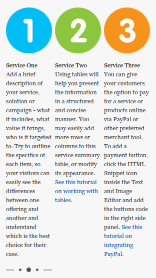
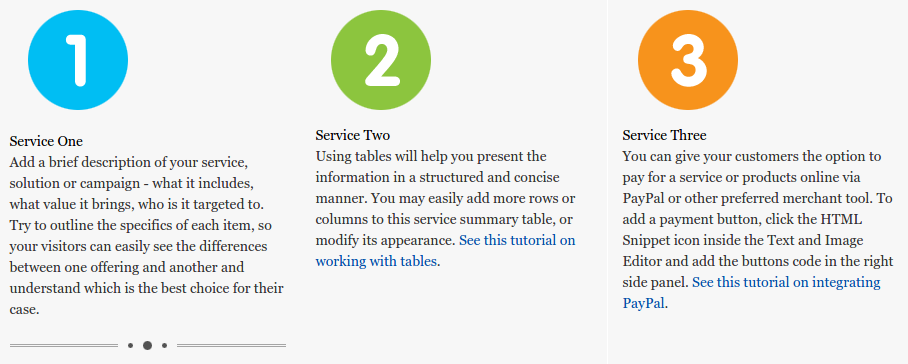
Below are a few examples of how the same content can appear with tables and with section groups under mobile view:
On desktop the tables and section groups appear the same on this example:On the left screenshot you can see the example with tables, and on the right with section groups:
2. When adding images within a text and image editor, you should consider the following:
the images will always scale to fit the screen, regardless of size or effect.
if you are adding images next a text, it is best to use the Image Alignment and Text Flow option within the Text and Image editor, instead of using tables. This way the image will stack on top of the text in mobile view, instead of being pushed by the table size. Of course, on some designs you may find the use of tables better fitted.
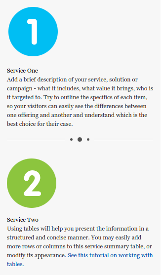
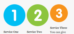
Below is an example of how images scale in mobile view:
Here is how the images appear desktop view:
Here is how the images appear when scaled down. You can see the big images have been resized, and the small image remains the same, since images will only be scaled down:
Other than that, all other elements will fit your responsive design by default. You can always check the element specific behavior section of this article for more details.

If you have a custom design or legacy design re-applying the design is not an option, we can advise on re-creating the design with the use of the DesignPro Editor. Here are some steps that you can take:
duplicate the website using the Duplicate Site option under the My Account menu
now that you have a copy of your account, go ahead and change the design of the original from within the DesignPro Editor.open a second browser and login in one of the websites there. The second browser is needed, so you can access the Admin interface of both sites.
now you can open the DesignPro Editor for both sites and start updating your original site, by looking at the copy for reference.

