Overview
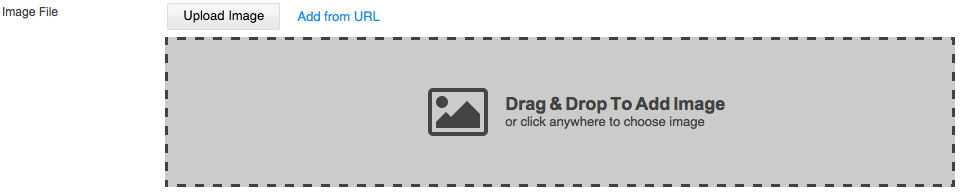
The File Upload Control is used to upload files to a specified location on the Web server. It is HTML5-based and extends the UI with drag & drop upload feature. The users are able to drag files from their desktop (local filesystem) as well as from the current or another browser window. Or the file can be uploaded from URL. The class that controls the File Upload Control is SK.UI.FileUpload.
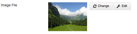
Preview of File Upload Control
Include Resource Files
The FileUpload class is included by default within the Admin area of the web site builder, however the File Upload can be used for File Upload Control in the published web site as well, for instance if an application requires file upload control. In that case the file dependencies need to be included.
/Shared/UIComponents/Internal/FileUpload
css/styles.css
<link type="text/css" rel="stylesheet" href="/Shared/UIComponents/Internal/FileUpload/css/fat_file_upload.css">
/Scripts/fat_file_upload.js
<script type="text/javascript" src="/Shared/UIComponents/Internal/FileUpload/Scripts/fat_file_upload.js"></script>
Default Options and Configuration
Name | Description | Type | Default Value |
|---|---|---|---|
dragndrop | Enable/disable Drag & Drop Upload | Boolean | true |
dragparents | Window object(s) whose dragenter & dragleave events to be observed in order to highlight the drop-zone | Array | [ window, parent ] |
dropzones | HTML Element(s) used for custom drop-zone(s) | DOMElement | $$([]) |
dz_showondrag | Whether to show built-in DZ only if a drag is present, otherwise show it by default when no file is currently uploaded | Boolean | false |
has_builtin_dz | If this option is false, the UI won't draw its default built-in drop-zone. However, if custom drop-zones are not defined, this option will always be considered as true | Boolean | true |
dz_caption_add | Default text caption for the built-in drop-zone when uploading file for first time | String | "Drag & Drop to Add image" |
dz_subcaption_add | Default text sub-caption for the built-in drop-zone when uploading file for first time | String | "or click anywhere to choose image" |
dz_caption_replace | Default text caption for the built-in drop-zone when replacing file | String | "Drag & Drop to Replace image" |
dz_subcaption_replace | Default text sub-caption for the built-in drop-zone when replacing file | String | "or click anywhere to choose image" |
dz_animate | Whether to fade-in with a smooth transition and then push the elements that are under them to the bottom on dragenter and to disappear with a smooth fade-out transition and all the elements that were under it should go upper with a smooth slide animation on dragleave or drop | Boolean | true |
dz_container | Custom container for the built-in drop-zone | DOMElement | null |
class | Sets custom class to the main DOM wrapper. Allows also to control the width/height (or other CSS styles) of the default drop-zone by CSS. | String | "fu-imagefile" |
container | DOMElement or element id where all elements will be created. | DOMElement or String | null |
source_type | Specifies how to initialize the control. To upload a file or URL. Options are "url" or "file". | String | "file" |
file_size | Size of the file in bytes. | Number | 0 |
url | If url has any value, the control will be created in preview mode. | String | - |
url_input_width | Width of the control. | Number | 150 |
error_message_width | Width of the error message. | Number | null |
show_upload_button | Visibility of the upload button. | Boolean | true |
upload_button_caption | Caption for the upload button. | String | "Upload Image" |
add_from_url_button_caption | Caption for the button to upload image from URL. | String | "Add Image" |
preview | Preview options of the uploaded file. | Object | { type : [ 'file_name' ] } |
validator | Used for file validation of file extension and size. | Object | { allowed_max_size : 0, allowed_formats : [ 'images', 'video', 'documents', 'audio', ] } |
buttons | An array of buttons names. Available buttons names are 'change', 'edit' and 'delete'. | Object | { list: [ 'change', 'edit' ]} |
Preview options:
type - Preview type. Available options are: "file_name", "flash", "image" and "none".
width - For "image" and "flash" this is the width of the image or the flash animation. The default one for "image" and "flash" is 200px. For "file_name" he text width of the file name in the preview. if it is a number, then the file name will be clipped, default is 'auto'.
height - Available for preview type "image" and "flash". This is the height of the image or the flash animation.
keep_proportion - Available for preview type"image". Whether or not to use image proportions for the preview. If value is set to 'false' - image preview area will ignore image proportions and can accept custom width and height values. Default is 'true'.
show_file_size - Available for preview type "file_name". The size of the file will be shown if the size property is defined and show_file_size is set to true. Default is "true".
show_icon - Available for preview type "file_name". Whether ot not to show the file type icon (doc, img, video, flash). Default is 'false'
Allowed formats and size for validator options are:
allowed_formats
images - "bmp","gif","jpg","jpeg","png","tif","svg"
video - "3g2","3gp","asf","asx","avi","flv","mov","mp4","mpg","rm","swf","vob","wmv"
documents - "txt","doc","docx","rtf","txt","csv","pps","ppt","pptx","sdb","wks","xls","xlsx","xml","svg","pdf"
audio - "aac","aif","iff","m3u","mid","midi","mp3","mpa","ra","wav","wma"
allowed_max_size - Maximum file size in bytes that is valid. If it is 0 then the size validation will not be made
Methods
Name | Description | Parameters | Returns |
|---|---|---|---|
getUrl | Returns URL path to the uploaded file. | - | String |
getFileSize | Returns the size of the uploaded file. | - | Number |
getInstanceId | Returns the unique identifier. | - | String |
getDomNode | Gets the root DOM element. | - | DOMElement |
Events
Name | Description | Arguments |
|---|---|---|
onBeforeComplete | Fires when upload is about to complete | arguments |
onComplete | It passes the event object created by the user interaction:in case a file has been chosen this will be the event object of the change eventif the user has set the file as a url - this will be the event object of the click event of the [Set] buttonif the user has dropped a file in a drop-zone - this will be the event object of the drop event. | arguments |
showDropzones | Fires when all drop-zones are shown | - |
hideDropzones | Fires when all drop-zones are hidden | - |
onBeforeStateChanged | Fires when state is about to be changed | - |
onStateChanged | Fires when there is a change in the state | - |
dragenter | Fires when getting in Drag & Drop area | - |
dragleave | Fires when leaving Drag & Drop area | - |
sourceTypeChanged | Fires when changing the source type. | source_type |
onBeforeSubmit | Fires when URL or file is added for upload. | - |
onSubmit | Fires when URL or file is added and the upload is triggered. | - |
onError | Fires when validation of file extension and size fails. | message, return_state |
setEnabled | Fires when file upload buttons have to be enabled/disabled. | Boolean |
onAfterImageEdit | Event listener fired when image file has been edited with the built-in Image Editor. | Boolean |
onCancelUpload | Fires when file upload has been cancelled. | Boolean |
onButtonDelete | Fires when the button to delete file is clicked. | - |
onButtonChange | Fires when the button to change file is clicked. | - |
onButtonEdit | Fires when the button to edit file is clicked. | - |
Examples
Creating a file upload instance: